How we built CarboFlow’s intuitive HMI
Modern pyrolysis machines are powerful and often very complex pieces of engineering. Whilst we understand our machines down to the last bolt, how do we make sure an operator understands the controls, flows and intricacies? This falls on the Human Machine Interface (HMI) which is, in very simple terms, a display screen used to control the machine.
Project successes
Andrew
Modern pyrolysis machines are powerful and often very complex pieces of engineering. Whilst we understand our machines down to the last bolt, how do we make sure an operator understands the controls, flows and intricacies? This falls on the Human Machine Interface (HMI) which is, in very simple terms, a display screen used to control the machine.
After years in development and several iterations of our pyrolysis reactor, we wanted to make sure that our accompanying HMI matched up. While equipping our machine with advanced operations and cutting-edge controls was crucial, it was equally important to design a simple yet intuitive HMI that would make operating the machine safe and easy.
Continuous pyrolysis operations run day and night - operators are often busy, fatigued, or non-technical and a single control mistake can cascade into lost yield or downtime, equalling loss of revenue. We knew that our interface needed to support fast, correct decisions that could be made by anyone by intuitively following instructions on the HMI.
CarboFlow’s HMI design underwent three iterations of changes before we arrived at a display that makes it significantly easier and intuitive to understand and operate the machine. Using the basic principles of UI/UX design, we focused on the following:
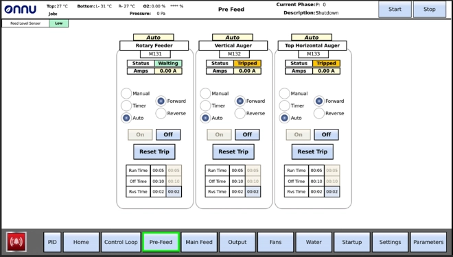
1. Segmentation: breaking down complexity
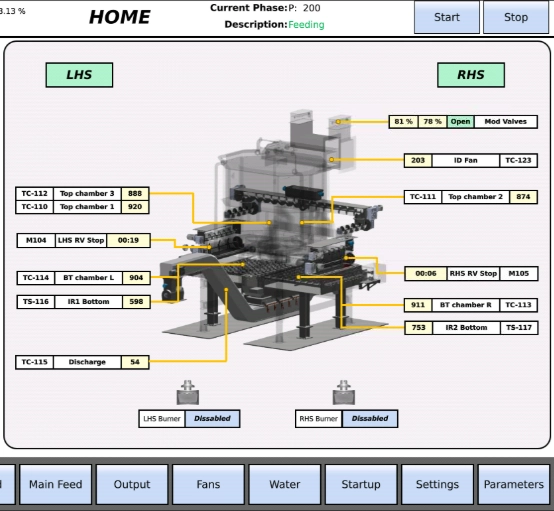
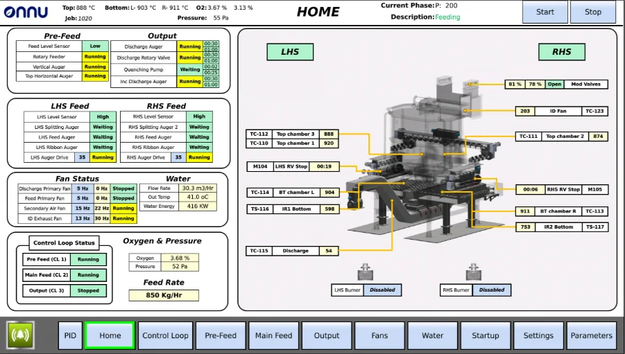
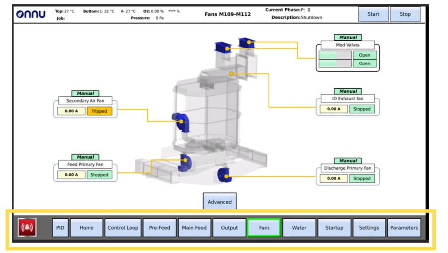
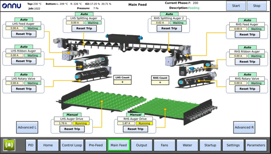
Even though CarboFlow is big and complex; it is, in reality, just made up of smaller units that are working together. So, we logically broke our machine into separate systems, dedicating a page on the HMI for each. This helps make sense of the machine’s flow of operations.
2. Simplification: less jargon, more visual cues
Sometimes words end up confusing people rather than helping them, especially the technical ones that almost sound like a foreign language to the layman. Thus, we decided to use visual cues. These cues convey more than jargon:
a. Identifying machine components using graphics rather than just words help clearly indicate what component of the machine is being referred to.
b. Colouring the graphics with standard colour codes (like green for running and red for trips) conveys the component status much better.
c. When an alarm sounds, a flashing red component on the HMI brings the users attention to the required component much quicker.
3. Pattern recognition: displays with colour codes
Humans are, by nature, logical beings that actively try to formulate patterns to understand systems. Using this attribute, we used specific colour codes for control buttons (blue), static display values (beige) and operational display values (green, yellow, red). Patterns like these help the user to map and understand the screen quicker.
4. Removing redundancies: keeping only what’s needed
While redundancies are obvious in simpler systems, mapping complex systems can result in redundancies that go unnoticed. These then further add to the complexity and cognitive load of the screen. We tested different versions of the HMI on would-be users to see how they used the interface. We removed repetitions and kept only what was necessary on each screen, so that the user sees only what needs to be seen.
5. Layers of control: basic and advanced
The machine has several controls - some of which aren’t accessed frequently. Moreover, several controls are meant for advanced operators to modify default settings and not meant for every-day operations. Thus, if we added all the associated controls and settings onto the basic views, non-technical operators could find this confusing. Instead, we have created 2 layers for the HMI - basic and advanced. This avoids confusing non-technical users while also allowing technical operators to access advanced settings.

The process of HMI design optimization will keep evolving as we seek feedback from basic as well as advanced users. Some of our future plans for CarboFlow’s HMI involve adding motion animations to the components, creating another layer of simple interactions for quick actions, developing better graphics to make mapping of components from screen to reality more intuitive, and much more. The end goal will always be to ensure that regardless of experience, expertise and knowledge, any user should find operating the machine simple, clear and intuitive.
Related insights
4 Steps to Planning a Successful Pyrolysis Project
To ensure your project is viable, and to give you a solid foundation when engaging suppliers or investors, it is essential to get to grips with the basics first. Here are the four critical steps to planning a successful pyrolysis project.
How CarboFlow uses pressure to maximize energy capture
One of the features that truly sets CarboFlow apart, is how it captures and reuses heat - converting it into steam for green energy production. We explore how this all works...